Homepage

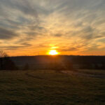
Bodie Island Lighthouse on the Cape Hatteras National Seashore. (Photo by Kurt Moses/National Park Service)
From The Mountains To The Outer Banks
The North Carolina State Climate Office serves as the primary scientific extension resource for weather and climate science for the state of North Carolina. The office achieves its mission through climate science monitoring, education, extension, and research.
ECONet
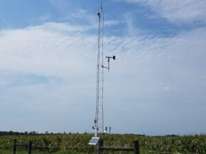
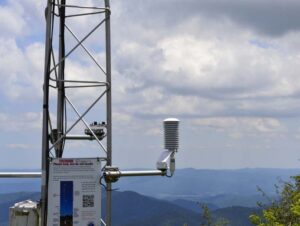
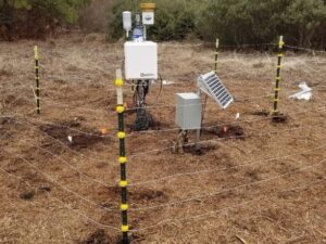
Our office hosts the North Carolina Environment and Climate Observing Network (ECONet). Learn more about the 44-site network here.
Education
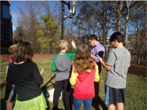
Learn about our state’s unique climate and weather and browse classroom-ready lessons and activities.
Data + Products
Explore North Carolina’s climate, and access climate data and climate-smart decision support tools with our suite of products.
Research
Our office conducts original research on many aspects of North Carolina’s climate and weather. Learn more here.
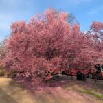
- Rain Returns and Pollen Proliferates in a Warm March
 It was a record wet March in parts of North Carolina, while the entire state experienced warm temperatures and the corresponding arrival of pollen season…
 - March Mayhem: Remembering the 1984 Tornadoes, Forty Years Later
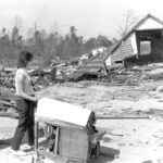 Things that take a lifetime to build can be destroyed in mere moments. Case in point: March 28, 1984, when a line of tornadoes carved…
 - Winter Recap 2023-24: Rain Returns, but Snow Stays Away
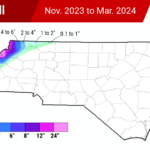 The long-awaited arrival of El Niño late last year helped our winter start with a splash, with multiple rain events across the state in December…
 - Spring Leaps In, Drought Creeps Back in February
 Warm weather dominated last month, and so did dry conditions across much of the state. In light of those unseasonable stretches, we look at how…